

Anchor every user visit with intent
When you design applications with user intent in mind, it's much easier to know where users get stuck. Your app is map, not business logic. Read: "Everything Starts Out Looking Like a Toy" #276

Hi, I’m Greg 👋! I write weekly product essays, including system “handshakes”, the expectations for workflow, and the jobs to be done for data. What is Data Operations? was the first post in the series.
This week’s toy: a website consisting of very, very efficient websites - they are all below 512k in size. For perspective, this means a whole website is running on less code than a lot of browser includes. Super small!
Edition 276 of this newsletter is here - it’s November 10, 2025.
Thanks for reading! Let me know if there’s a topic you’d like me to cover.
The Big Idea
A short long-form essay about data things
⚙️ Anchor every user visit with intent
We’ve all been there. You start using a product and get an email that arrvives so that you can finish verifying your account. Clicking the link lands you onto a blank dashboard with no key message and no hint of what you were doing.
Immediately, you feel that you forgot to do something but you can’t tell what needed to be done. It’s not clear whether you completed the task or whether there is more work to be done.
This is a great example of the assumption that products are built around feature maps, not human intent. As product designers, we think about the task users need to create, and less about the way they will feel when they don’t know what to do next.
When users end up on a dashboard and don’t know what to do, the product needs to handle the null state more effectively.
People feel behind when they forget why they’re here
When a customer lacks confidence, often their intent is misunderstood and poorly mapped by the application.
Customers might not say it this way and might ask, “how do I do that {{thing I want to do}}?”
Here’s one way to address this from the product perspective:
Underneath every click, there’s an intent — a verb.
Users think: renew, upload, update, cancel, check, finish.Products, on the other hand, think in nouns:
/insurance,/billing,/settings,/files.
Users are constantly translating between what they want to do and where they need to do that in the product.
That naming gap between intent and information architecture is where guilt creeps in.
“Guilt is what happens when users carry
the burden of reconciling their intent with your architecture.”
When the system forgets why someone arrived, users start to assume they did something wrong.
Applications need to listen to your intent
To align user action and intent with the current product location, you will need to consider separating two concepts your product treats as a single idea:
Homes – stable landmarks that never move (
/dashboard,/files,/conversations)Intents – structured metadata describing why a user arrived (
RENEW_POLICY,UPDATE_PAYMENT,UPLOAD_DOCUMENT)
Most teams try to shove both meaning and navigation into the URL, and that how you end up with URL gems like /insurance/application/v3/app/showAppIndex.tsx.
URLs are not just addresses. They are wayfinders that tell you where you are right now. What they don’t always tell you is why you’re there.
You need both transport to the right place and the clear meaning of that intent.
But only one of them should carry the emotional weight.
Intent as a first-class object
Think of intents as typed system objects, not vague labels.
They’re not infinite — they’re known enums, each with a clear handler and lifecycle.
The business logic in your intent should live in your system, not in the URL string.
In a typical flow:
User clicks a CTA in an email: “Fix your payment.”
Link goes to a stable route like /billing?intent_id=abc123 (or uses a signed token).
Backend resolves intent_id → IntentContext.
What would it look like with an intent-based focus?
The page renders based on:
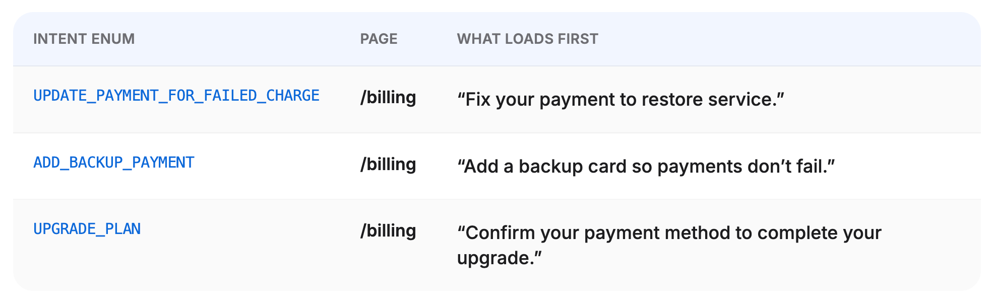
The home (/billing)
The intent (UPDATE_PAYMENT_FOR_FAILED_CHARGE)
The user lands on /billing.
The system sees: Intent: UPDATE_PAYMENT_FOR_FAILED_CHARGE.
The page responds accordingly:
Heading: “Fix your payment to keep your coverage active.”
Primary CTA: “Update card.”
Clear completion state: “You’re all set.”
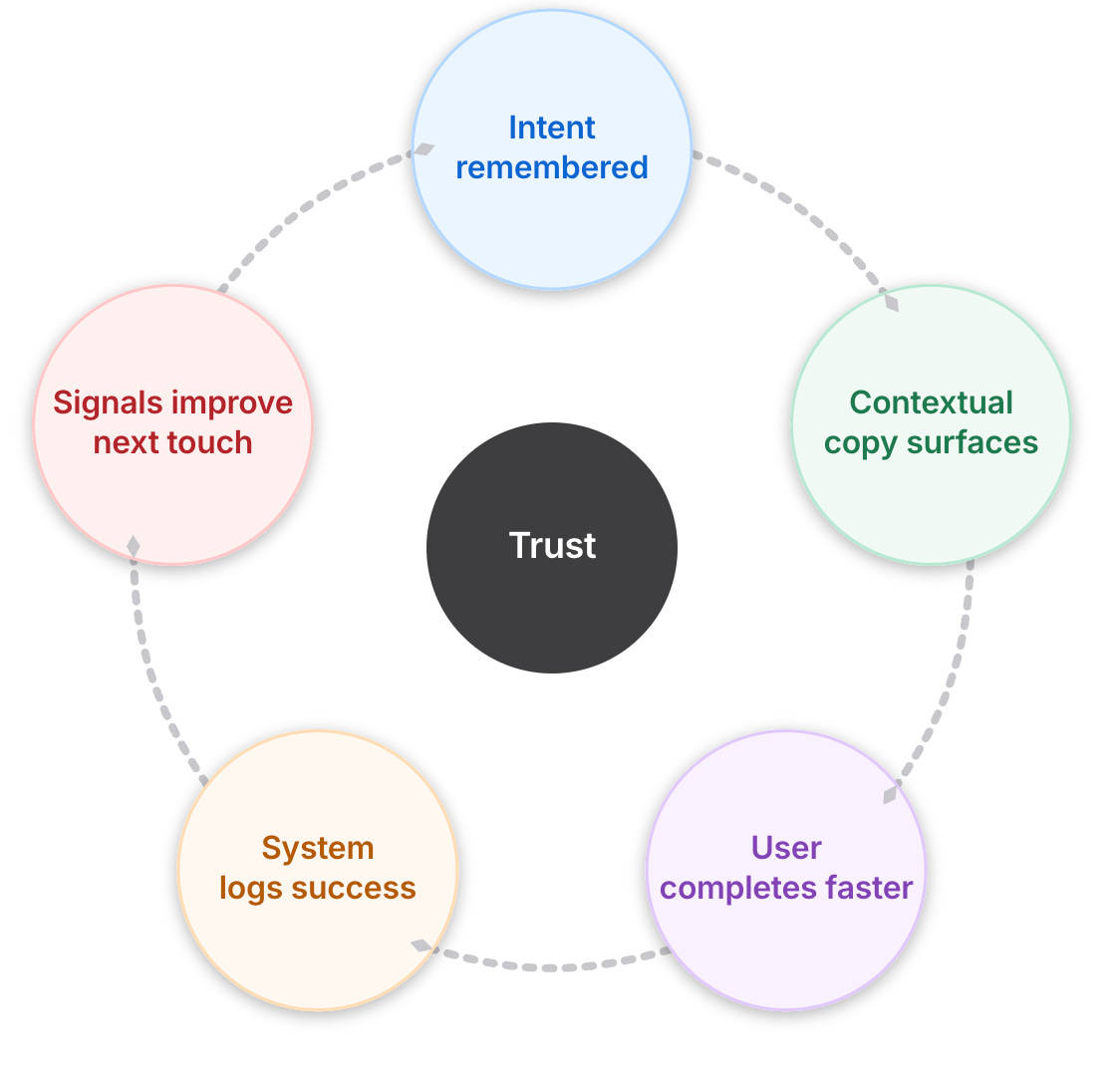
When the system remembers why the user is there, the outcome is better for the system and the user.
How does handing intent feel different?
When visiting an app with different intents, the user might see pages that seem like variants of the same thing.
To the system, these are very different workflows, which is the point.
Ideally, the user shouldn’t notice the reuse, and the system should never forget why they’re there.
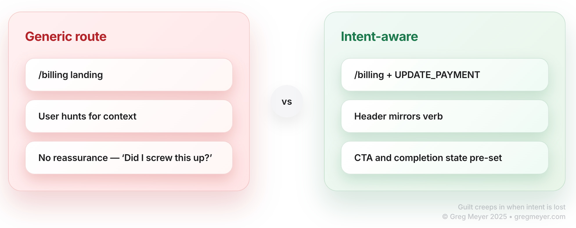
If a user clicks “Finish closing my account” and lands on a generic settings page with no close-account flow in sight, they don’t think:
“Ah, routing mismatch.”
They think:
“Did I screw this up?”
That’s preventable.
Adding explicit intent checks builds trust
When intent is explicit and carried through, several negative UX patterns improve:
“I don’t know where to do” becomes “I can see what’s going on”
“I don’t know where to go.” Intent links drop users directly into the right context instead of dumping them at a generic hub.
“I started and abandoned something.” The system remembers partial progress and presents it neutrally: “Pick up where you left off?” without scolding.
“This page doesn’t make sense.” The page reads IntentContext and mirrors it in heading, copy, and CTAs. Users feel oriented, not lost.
“I must have missed something” becomes “I can recover my progress”
From: “I’m behind. I must have missed something.”
To: “The system knows what I’m trying to do and is helping me finish or step away cleanly.”
User confusion comes from repeated misalignment between what I meant and what the product reflects back.
How do you put this system in practice?
Building intent into your application requires you to make some architectural choices when designing the app. Remember, you’re not supporting any random intent: you’re bucketing the available intents into known areas and making it easier for the user to understand.
This leads to a few design principles:
Always pass intent explicitly
Use intent_id or a signed token.
Don’t guess based on referrer, UTM tags, or brittle path parsing.
Degrade gracefully when intent is missing
If intent_id is invalid or expired:
Show a safe default: e.g. the /billing home with clear options.
Offer obvious next actions: “View invoices,” “Update payment,” “Contact support.”
Never strand the user in a blank or irrelevant state that implies their error.
Keep homes stable
/dashboard, /files, /conversations, /billing should be durable landmarks.
Intents layer on top of these; they don’t replace them.
Measure by intent, not just route
Log IntentType and intent_id through the flow.
Track: Completion rate by intent, Drop-off points by intent, Time-to-complete per intent
This is how you identify which verbs are guilt-inducing and need redesign.
Keep the enum vocabulary tight
Don’t let every team invent bespoke string intents.
Maintain a controlled set (e.g. 10–40 for a complex product).
If your system can’t answer, “What was this user trying to do?”
This isn’t personalization theater. It’s structured empathy.
“Intent-aware” can sound like overfitting or creepy personalization. This model is neither.
The product remembers why a link was sent, and the page reflects that purpose.
If context is missing, the product fails soft and offers alternatives /
Why do we want design without guilt?
Most products organize around nouns. Users move through the world in verbs.
If you want to reduce guilt and build trust, your product has to meet them at the verb layer.
The URL is just how you got in the door. The intent is why you came. Design systems always remember the why, even when multiple whys share the same room.
What’s the takeaway? Design your flows to minimize guilt and maximize observability. When a user lands in your app, they should know why they are there and that you recognize what they wanted to do. When they get lost, they need a wayfinder instead of an ambiguous task to complete.
Links for Reading and Sharing
These are links that caught my 👀
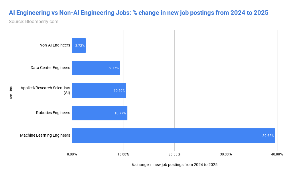
1/ Which jobs does AI take away? - predictably, not AI engineering jobs. Some really interesting tidbits here by Bloomberry.
2/ Are we in a bubble? - Probably, if you’re paying attention. And bubbles also generate great outcomes along with hardship when they pop. Ben Thompson reviews a history of bubble outcomes, and wonders what we’ll remember from the inevitable end of the AI bubble.
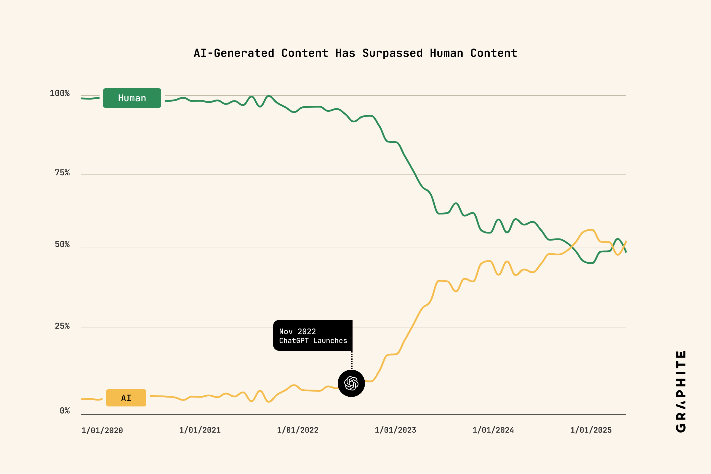
3/ AI content rubicon? - As of mid 2024, the amount of content generated by AI surpassed human content. But according to this data, it hasn’t continued to grow. But that doesn’t seem right given the amount of AI slop we’re seeing. Does that mean AI content is getting better or that it’s just moving around to different modalities (video)?
What to do next
Hit reply if you’ve got links to share, data stories, or want to say hello.
The next big thing always starts out being dismissed as a “toy.” - Chris Dixon