

Why prototypes need to be ugly
Why prototypes need to be ugly
"Everything Starts Out Looking Like a Toy" #80

Join smart, curious folks to get the Data Ops 📊 newsletter each week (it’s free!)
Hi, I’m Greg 👋! I publish this newsletter on finding data products and interesting data observations with the goal of finding patterns and future product insights. (Also, it’s fun.) If you need a background on how we got here, check out What is Data Operations?
This week’s toy: an Etch a Sketch-like tool built entirely in Google Sheets. Edition 80 of this newsletter is here - it’s February 7, 2022.
The Big Idea
A short long-form essay about data things
⚙️ Why prototyping needs to be ugly
Zach Lloyd wrote this short piece on the biggest mistake he sees engineers make. What is it? Moving forward with too much work before they get feedback that they are on the right track.
As Zach puts it, when this happens:
We end up in a position of dealing with the Sunk Cost Fallacy where it hurts to abandon the work already done in order to get back on track – if we aren’t careful, we’ll end up shipping the wrong thing because we didn’t want to swallow the sunk cost.
Why does this happen? Lots of reasons, and the core one is that people are proud of what they do. The farther along they get on an idea without feedback, the more likely it is that changing their idea will feel like a defeat rather than a redirection.
Start prototyping immediately
“But this is code”, you say, and “we should trust software developers to build software.” Yes, I’m absolutely in favor of letting smart and motivated software designers innovate with software. We also should stop them as soon as possible when they are working on something that might not add value.
A common way to express this problem is something called the “cone of uncertainty” – essentially, the idea that you have much more variability in cost and time at the beginning of the project than at the end when you have a solid agreement on what to build – and we need an easy way to go from less certain to more certain.

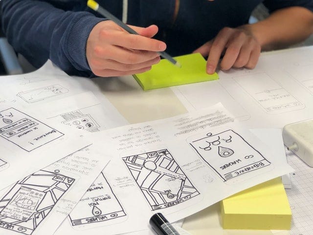
How do we find out whether we are on the right track? Before writing code, we should be doing very simple prototyping. Our goal: to get the logic of a flow, or decide on the basic structure of a feature, or to play with an idea before it’s figuratively set in stone.
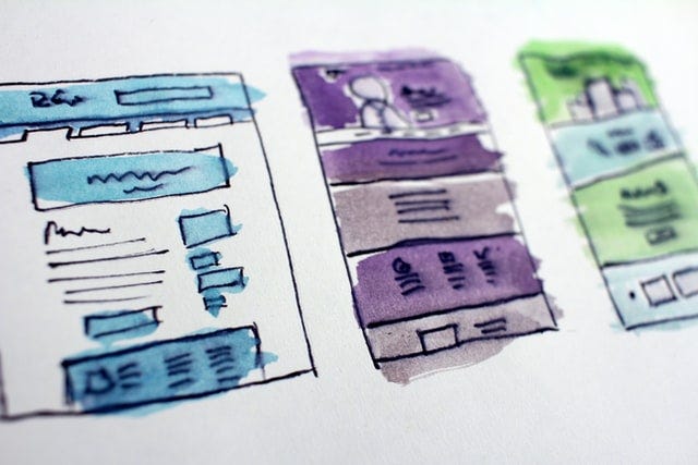
Making things deliberately lo-fi
Google’s Jamboard is a great way to test your ideas while keeping things very simple. In fact, it’s very hard to make things complicated while using Jamboard.
Take this simple example of a login that gets information from a back-end service, and then presents a button with a label.

You could build a complicated framework to make this happen, or just draw a picture to imply the process. Instead of asking a developer to build, getting a result back, and not knowing what we see, we can build a few prototypes that display visually what’s happening.
The overall process looks like this:
Build a basic prototype for understanding (timebox to 1 hour)
Update, fix, and redraw
Share with team members for understanding
Go back and build a low or high-fidelity sketch
Finalize with real use cases and we’re ready to build
When the group agrees that the prototype is heading in the right direction, we’ve reduced the cone of uncertainty significantly. Note: prototyping doesn’t replace a great product or feature requirements document. It does make it easier to get to a PRD everyone can support.
Why prototyping?
It’s simple. You get to the core of the idea faster. Whether you are using paper prototyping, building a digital sketch, or drawing on a whiteboard, prototyping gives you a way to talk about an idea before you’ve got so much invested that you don’t want to change.
Using a deliberately lo-fi idea also makes it so you spend less time on the prototype itself. It’s a hack to getting to a better feature.
What’s the takeaway? Using the time in “norming and storming” to draw simple pictures and break the feature process down to a set of decisions before development work is started in earnest builds a better product feature.
A Thread from This Week
A Twitter thread to dive into a topic
When dashboards don’t track to shared understanding, they can amplify the gap between departments. This makes it all the more important to agree on definitions.

Links for Reading and Sharing
These are links that caught my 👀
1/ Make your product easier to buy - finding scale is really about finding the answers to how your customers really want to buy.

Solving customer pain is necessary, but not sufficient to achieving customer success. This means it’s really important to know how to remove friction in the buying process (bonus points if you create a repeatable way to do this.)
2/ Practice active listening - in your new conversation, you can listen better and hear more. This First Round article has helpful tips on building the tools for active listening. You have two ears and one mouth - this is a good ratio for how much you need to talk to prospects (hint: let them talk).
3/ This photo is not real - Do you wonder what Disney characters might look like when rendered as photorealistic “people”? This series questions what we’re looking for when we say we want to experience “real” film and also suggests that deep fakes are going to get a lot weirder soon. The “uncanny valley” doesn’t seem as uncanny now.
On the Reading/Watching List
Some things to watch or read, in no particular order
Watching: The Batman’s final trailer looks … epic.
Listening:
I recently found the Data Skeptic podcast, which is dedicated to making data science topics easier to understand for the non-technical listener.
What to do next
Hit reply if you’ve got links to share, data stories, or want to say hello.
I’m grateful you read this far. Thank you. If you found this useful, consider sharing with a friend.
Want more essays? Read on Data Operations or other writings at gregmeyer.com.