

Why product managers are hiding change behind old interfaces
We've gone beyond having sparkly buttons to systems that anticipate your needs. Software is getting smarter behind the scenes. Read: "Everything Starts Out Looking Like a Toy" #265

Hi, I’m Greg 👋! I write weekly product essays, including system “handshakes”, the expectations for workflow, and the jobs to be done for data. What is Data Operations? was the first post in the series.
This week’s toy: if you’ve ever wondered about the mathematically correct method of cutting an onion (or just wanted to get your rough chop to optimal size), you’ll want to check out this data visualization.
Edition 265 of this newsletter is here - it’s August 25, 2025.
Thanks for reading! Let me know if there’s a topic you’d like me to cover.
The Big Idea
A short long-form essay about data things
⚙️ How software gets smarter without appearing to change
It's been about three years since AI features started appearing broadly in consumer software and you might have noticed a trend that's accelerating. AI sparkles (that's what I call the use of the "Ask AI and ✨ emoji") are going away instead of becoming more prominent.
New and existing software UX looks ... pretty much the same as it always has. Although there are some companies building whizbang new UX, a lot of it looks like old software. But AI features inside of that software are accelerating.
What's going on (from a UX perspective)?
The goal of introducing additional intelligence into software is to deliver better outcomes. Product managers are quietly hiding new superpowers behind interfaces that look the same (or very similar) than they did before.
The spreadsheet still looks like a spreadsheet. The inbox still looks like an inbox. Photoshop still looks like Photoshop. But under the surface, the tools are learning, suggesting, predicting. They're getting smarter without ever asking you to notice.
This wasn't inevitable. In fact, the first wave of "intelligent software" tried something different.
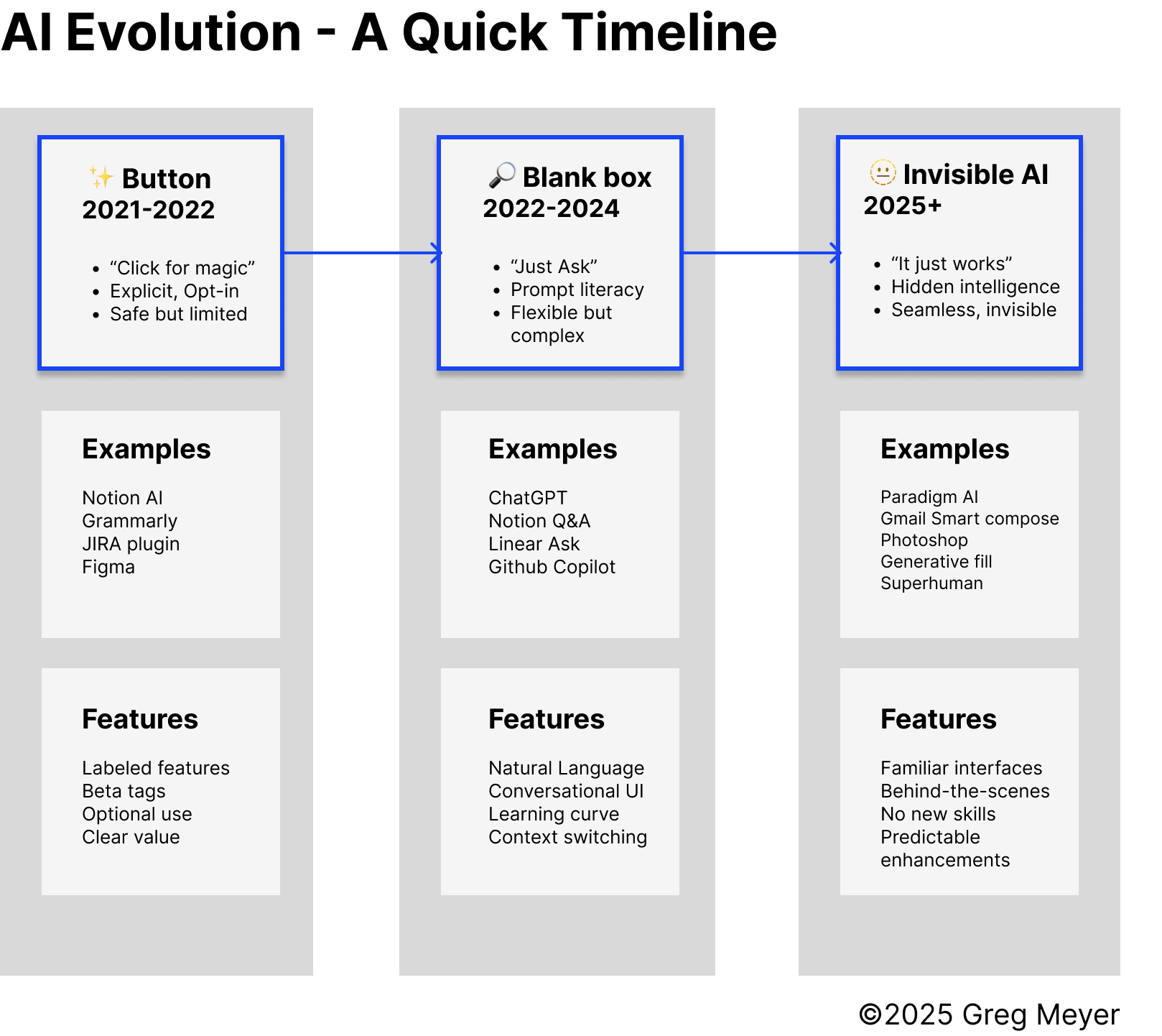
Remember the ✨ button?
Notion, Grammarly, JIRA and others rolled out explicit, labeled features that said "click here, the magic happens now". It was a safe bet. Users could try it, ignore it, or laugh at it. And by labeling this a "beta" or an "experiment", it made it safe to a/b test it or explain away some weird results.
But the ✨ button revealed a deeper truth. A lot of users had not idea what to do with these features when they were offered directly. Giving people magic powers is one thing, and teaching them how to wield those powers is another.
Why the ✨ button era made strategic sense (probably)
Product managers likely chose this explicit approach for one fundamental reason: cognitive load management. Users were already familiar with these tools, and adding AI as an optional feature didn't disrupt existing workflows or require new mental models.
But there might have been a deeper strategic insight here: people don't know how to use AI yet because it's too new. By making AI opt-in and clearly labeled, companies could:
Build Trust Gradually: Users could test AI features on low-stakes tasks before relying on them for important work.
Mitigate Adoption Risk: If AI features failed, the core product remained functional. Users could simply ignore the AI and continue working as before.
Create Clear Value Propositions: AI features could be positioned as premium add-ons, making the benefit obvious to users and stakeholders.
Establish Competitive Positioning: Being first to market with AI features created differentiation, even if the implementation was basic.
The key insight (if this theory is right): this wasn't just about user experience—it was about recognizing that AI was too complex for most users to handle without explicit guidance.
When "just ask" became work
The next version of "give the user superpowers" borrowed from Google's search page. Using the promise of "just ask" or producing a specific ghost text prompt based on the page where you ask a thing makes it a lot clearer what to ask.
But the blank box era revealed what appears to be a fundamental problem: prompt literacy is a skill most users don't have and don't want to learn.
While conversational AI showed promise, it seems to have created significant cognitive load:
Prompt Fatigue: Users appear to have grown tired of constantly formulating requests and managing conversations. This wasn't just about effort—it was about cognitive overhead that most people couldn't sustain.
Context Loss: AI systems struggled to maintain context across conversations, forcing users to constantly re-explain what they wanted. This created more work, not less.
Unpredictable Results: The conversational nature made it impossible to predict when AI would be helpful versus when it would fail. Users couldn't build reliable mental models.
Learning Curve: Users had to develop entirely new skills (prompt engineering) to effectively use AI features. This was the opposite of reducing complexity.
Blank box interfaces don't solve the cognitive load problem—they just move it around.
When intelligence disappears
Product managers responded to this by making different decisions.
Don't make people ask. Don't make them learn. Instead, tuck the intelligence behind the patterns they already know.
This looked more like a spreadsheet interface with AI-powered data analysis and insights. Or AI-generated email suggestions that appear as users type. Or maybe AI-powered audio and video editing through familiar timeline interfaces.
This is the real shift: from explicit to invisible, from "here's some magic" to "the tool just works better now."
The design choice is deliberate. It's not that the underlying systems can't do more; it's that users can't handle more—at least not yet.
The interim state dilemma
We're now seeing more value from AI output. Things get done better, faster, and users can start from text phrases rather than app actions. But this creates an interesting tension.
Product managers are choosing between two interim states:
The “Blank Slate” Approach - type words into a search box and let AI figure out what you want. This is what ChatGPT, Notion Q&A, and Linear's Ask Linear represent.
The “Invisible AI” Approach - AI helps you behind the scenes and you don't even know it. This is what Paradigm AI, Gmail Smart Compose, and Photoshop Generative Fill represent.
My prediction … invisible AI will win
For most software, AI behind the scenes and you don't know it is going to win. At least, that's my bet. Here's my reasoning:
Lower Cognitive Load: Users don't have to think about AI at all. They just get better results from tools they already understand.
Faster Adoption: No new skills required, no new mental models to learn, no prompt engineering to master.
Better Integration: AI enhances existing workflows rather than creating new ones, reducing context switching and friction.
Competitive Moat: Once users experience invisible AI, switching to products without it might become painful. The intelligence could become part of the tool's DNA.
Scalable Intelligence: AI could improve across all user interactions, not just specific features, potentially creating a compounding advantage.
The blank slate approach will persist for creative tasks and exploration, but for productivity software, invisible AI will likely dominate. (Unless I'm completely wrong about this.)
Learning from past technology shifts
We might have seen this pattern before. The evolution of AI integration could follow patterns we've seen before in software development:
GUI vs CLI: Early computers required command-line interfaces. The shift to graphical user interfaces made computing accessible to non-technical users. Similarly, invisible AI might make AI accessible without requiring technical expertise.
Search vs Directories: Early web navigation relied on curated directories. Search engines made finding information effortless. Invisible AI might make getting results effortless without requiring users to formulate queries.
Auto-save vs Manual Save: Early software required users to remember to save their work. Auto-save eliminated this cognitive burden. Invisible AI might eliminate the burden of managing AI interactions.
Spellcheck vs Clippy: Spellcheck works silently in the background, improving text without interruption. Clippy was intrusive and often unhelpful. The lesson (if it applies): invisible improvements might beat visible interruptions.
Strategic implications for product managers
Consider Invisible AI When:
Users have established workflows that shouldn't be disrupted
AI can provide consistent, reliable improvements
The goal is to enhance rather than replace existing functionality
Users are likely to be skeptical of AI features
Consider Explicit AI When:
Users need to understand AI's role for trust or compliance reasons
AI capabilities are genuinely new and require user education
Users want control over when and how AI is applied
The AI feature is the primary differentiator
Hybrid approaches might win
While invisible AI might represent the current best practice, the future could involve hybrid approaches that combine the best of all three phases:
Invisible Defaults with Explicit Controls: AI that works automatically but allows users to take control when needed. For example, Gmail's Smart Compose suggests text but lets users easily accept, modify, or reject suggestions.
Contextual Intelligence: AI that adapts its visibility based on context. In high-stakes situations, AI might be more explicit about its involvement. In routine tasks, it operates invisibly.
Progressive Disclosure: AI features that start invisible but become more visible as users become comfortable with them. This could build trust while maintaining the benefits of seamless integration.
Design for what users can handle now
The evolution from ✨ buttons to invisible AI might not be just about technology—it could be about design decisions to limit complexity. Product managers might be choosing familiar UX formats because the cognitive load of using AI is simply too high for most people right now.
The future might belong to products that make AI invisible by default but controllable when needed. Users probably want intelligence that enhances their capabilities without requiring them to become AI experts or change their behavior. Products that deliver on this promise could build sustainable competitive advantages and create experiences that feel magical precisely because they don't feel like AI at all.
But remember: this isn't just about user experience. It's about recognizing that people don't know how to use AI yet because it's too new. So design for what users can handle now, not what they might be able to handle in the future.
Because the best kind of upgrade is the one you only notice once it's gone.
What’s the takeaway? For product managers, the lesson (if this theory holds) isn't to chase intelligence for its own sake. It's to design for the limits of what people can handle now. Hide the power until it feels natural. Build interfaces that don't change while the experience does.
Links for Reading and Sharing
These are links that caught my 👀
1/ How to get better at AI - “AI tools are a regression of the mean. If you’re below average in a domain, AI will make you average.” -Chris Wong and Louie Bacaj on the strengths and weaknesses of AI.
2/ On the value of Glue Teams - The team at Posthog does an excellent job explaining a Glue Team, a valuable cross-functional role that’s not always understood. (If you’re thinking about a platform team or a stream-aligned team, you’ve got the right idea). Every org needs at least one of these teams.
3/ What makes good documentation? - It helps to have a strong point of view on how to help users.
What to do next
Hit reply if you’ve got links to share, data stories, or want to say hello.
The next big thing always starts out being dismissed as a “toy.” - Chris Dixon