Improve your SaaS Product Experience by Removing Choices
Users have a limited appetite for choice. If you don't use it wisely, they will balk. "Everything Starts Out Looking Like a Toy" #119

Hi, I’m Greg 👋! I write essays on product development. Some key topics for me are system “handshakes”, the expectations for workflow, and the jobs we expect data to do. This all started when I tried to define What is Data Operations?
This week’s toy: a browser game that’s almost like Pong. It’s so simple, and so hard at the same time. This is a timely reminder that game dynamics don’t need to be complicated to be good. Edition 119 of this newsletter is here - it’s November 14, 2022.
The Big Idea
A short long-form essay about data things
⚙️ It's not easy if your customer says it's not easy
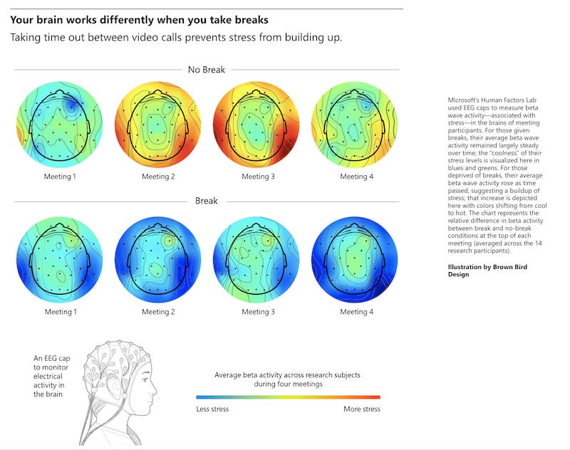
Users are tired. They are stressed. They are overworked.
They might be tired because they have too many meetings, have survived a pandemic, or are not getting any sleep.
Enter your product. You are asking them for attention, and want them to complete tasks, some of which might be brand new to them. How do you set up the situation so that you get more success?
Competing for mental space
“Short-term memory” is the way that we describe the small number of things (usually 5 plus or minus two) that we hold in our very immediate memory. We call it short-term because it literally lasts for only 15-30 seconds. But wait. How are we able to function if we can only hold tasks in our heads for 15 to 30 seconds?
There is a second, more expansive concept that psychologists have defined to explain the process of experiencing, processing, and storing information: working memory
Saul McCleod describes the process of working memory in this way:
Try answering this question: How many windows are there in the front of your house?
You probably find yourself picturing the front of your house and counting the windows. An image has been retrieved from LTM and pictured on the sketchpad.
Evidence suggests that working memory uses two different systems for dealing with visual and verbal information. A visual processing task and a verbal processing task can be performed at the same time.
It is more difficult to perform two visual tasks at the same time because they interfere with each other and performance is reduced. The same applies to performing two verbal tasks at the same time.
Working memory matters because unless your application makes it easy for users to iterate the process of try/learn/do they will get stuck and become unable to decide. There will be too many items to process at the same time and they will slow down rather than being able to take action.
Lowering the barriers for choice and action
Here’s a concrete example of this so-called “paradox of choice” that results in a situation where you ask a user to do too much. The article “When Choice is Demotivating” (Sheena Iyengar and Mark Lepper, 2000) describes an experiment measuring the propensity of shoppers to purchase different varieties of jam at an upscale supermarket in the Bay Area. The intent was to learn if choice affected the sampling or eventual purchase behavior of consumers.
The experiment was set up this way: one group of shoppers was offered 24 different varieties of jam at a tasting booth, while the other group of shoppers selected from a group of 6 jams. Shoppers were allowed to taste as many jams as they liked, and all got a coupon that enabled them a discount on a purchase of jam. The study was run on a few different weekends and had hundreds of participants.
What happens when there are lots of choices?
The Outcome of “Too Many Choices”

In Iyengar and Lepper’s “strawberry jam” experiment, interesting things happened when shoppers were asked to sample the product.
Here’s a summary:
60% of shoppers who passed the high-choice booth stopped to review the sampling options
At the limited-choice booth, only 40% of shoppers stopped to take a look
Despite this difference, shoppers sampled about the same number of jams (a range of 1-2 selections)
People were more interested in the increased choices but did not buy. The purchase rate from the booth with many choices was 3%, and customers at the limited-choice booth bought 30% of the time.
What did we learn? Overwhelmed people buy 10% as often as people with fewer choices. In a software environment, people could be overwhelmed by lots of meetings. They could have ambiguous requirements. It might be the first time they’ve ever seen your software, or perhaps it’s been a long time since they had to use it. All of these things provide extra cognitive load.
When you make things more complicated, you lower the likelihood of success.
There are things you can do to make things easier for the user.
What works well to decrease complexity?
There’s a laundry list of potential interventions to take a complicated flow and make it easier for the user. The overarching principle needs to be: Keep It Simple.
William Edmund Hick proposed this idea in 1952:
Hick’s Law states that the time it takes to make a decision increases with the number of options.
As a product designer or owner, you have the mandate to remove the number of options for any decision flow.
Here are a few ideas:
You can use design patterns to make it clear to the user what sort of task you are asking them to do.
Employing progressive disclosure hides less-used features out of the way.
Using an F-shaped pattern matches the way left-to-right readers read.
How will you know if things are easier to understand? Measure how many users are able to complete their tasks from end to end and ask them how they feel about the process.
What’s the takeaway? If app users act like consumers (and there is a reason to believe they do), it’s attractive to think that offering them more choice is better. This is a false signal: although more prospects show up, and about the same number try what you have to offer, many fewer prospects buy a complex solution when compared to a simple one.
Links for Reading and Sharing
These are links that caught my 👀
1/ How to calculate better metrics - Keeping with the theme of “Keep it simple, stupid”, when you create an application it’s handy to think about how you will quantify the results of experiments. Here’s a guide to creating simple SQL to store your aggregate metrics. Because it rolls up user tables into higher level ideas, this is a solid pattern to follow when seeking insight.
2/ Empathy maps help you step into the user’s mindset - Empathy Mapping is the process where you start with user stories and think about the statements, thoughts, and emotions that are happening and often unsaid. What is the user thinking when they do this, and what’s their motivation? Empathy maps help to visualize user activity and place it in context, letting you anticipate dead ends and problems.
3/ Quick tips on creating a data dictionary - it’s easy to say you need a Data Dictionary – a list of all of the important data metrics in your organization, how they are built, what they mean, and who owns them – and harder to do it. Here are a few tips on how to build one. Hint: start before you have data. If you already have data, these tips will help too.
What to do next
Hit reply if you’ve got links to share, data stories, or want to say hello.
Want more essays? Read on Data Operations or other writings at gregmeyer.com.
The next big thing always starts out being dismissed as a “toy.” - Chris Dixon


