

Stop Designing Your Graphics. Start Compiling Them
Building production-ready graphics that don't look like AI slop isn't easy. The secret: use AI as an orchestrator, not as the artist. Read: "Everything starts looking like a toy" #298

Hi, I’m Greg 👋! I write weekly product essays, including system “handshakes”, the expectations for workflow, and the jobs to be done for data. What is Data Operations? was the first post in the series.
This week’s toy: thinking about how choosing music has changed since the introduction of the iPod in 2001. Yes, some serious “old man shakes fist at cloud” stuff here, but building a mix tape used to involve more thought than prompting Spotify for workout jams (and yes, Spotify does a pretty good job at this now).
Edition 298 of this newsletter is here - it’s March 30, 2026.
Thanks for reading! Let me know if there’s a topic you’d like me to cover.
The Big Idea
A short long-form essay about data things
⚙️ Stop Designing Your Graphics. Start Compiling Them
Writers already do the hard part: turning messy thinking into a clear argument.
The frustrating part comes after. You finish a draft, you need a graphic that carries the point — not decorates it — and suddenly you are in Figma nudging text boxes.
Then you revise the draft. The headline changes. The framing shifts. And the graphic is wrong again.
This is the loop that kills publishing momentum. Not the writing. The maintenance.
I have been stuck in this loop for years. Every article I publish on FindDataOps includes graphics like comparisons, process flows, pull quotes. In the old world (before I wrote a package to do this), each one used to take longer to produce than the section it illustrated. I would finish a 1,500-word essay in an afternoon and spend the next two hours wrestling with visuals that were already out of date by the time I exported them.
So I built a tool to fix it. And the thing I learned building it changed how I think about visuals entirely.
The problem is not “making graphics”
The problem is that writing is iterative and publishing is unforgiving. You need graphics that hold their structure while your message changes. With prompt-to-pixels generation — the “make me an image of this” approach — the result drifts every time. Fonts shift. Spacing varies. Comparisons stop lining up.
You cannot tell whether a difference is your idea or just the renderer being inconsistent.
I tried the approach of building with StableDiffusion, ChatGPT, and Google’s Nanobanana. The process was almost always the same: describe what you want and get something that looked close but was never reusable. When you run the same prompt twice, you get two different layouts. The output was impressive and unreliable in exactly the wrong ratio.
This is an expected outcome with LLMs, because they are non-deterministic. If you want a repeatable process, you need to build something different.
What I actually needed was not an image generator. I needed a compiler.
What compiled graphics actually means
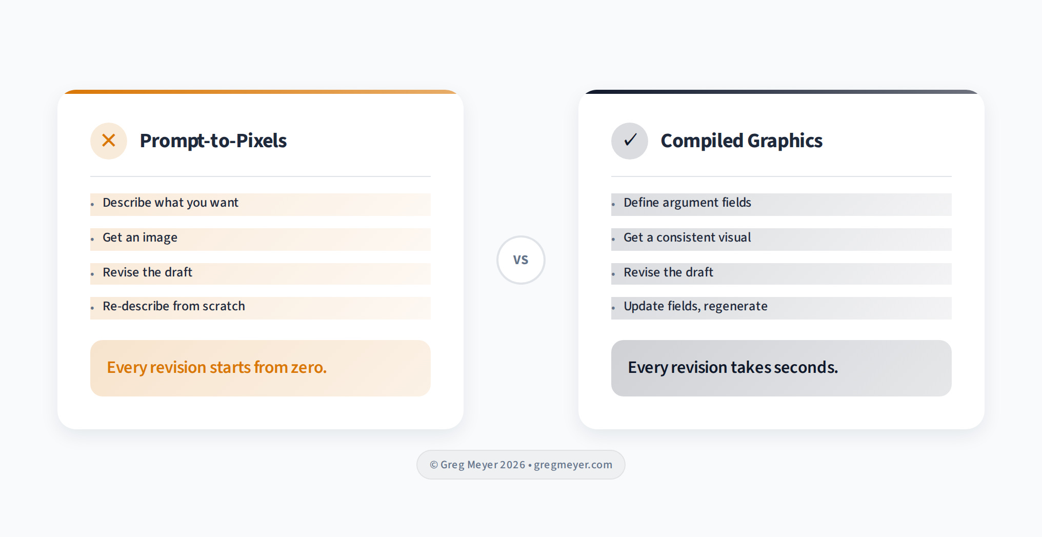
A compiler takes structured input and produces consistent output. Every time.
For graphics, that means separating what changes from what stays the same.
What changes:
your headline
your comparison points
your pull quote
The argument
What stays the same:
typography
spacing
color scheme
visual hierarchy
the design system.
When you revise the draft, you update the argument fields and regenerate.
The design system holds. No Figma. No pixel-pushing. The graphic follows the writing.
This sounds obvious. It was not.
The first version of Modern Graphics shipped as a CLI tool. You would run a command, pass in your comparison text, and get a PNG. It worked. But nobody used it the way I expected.
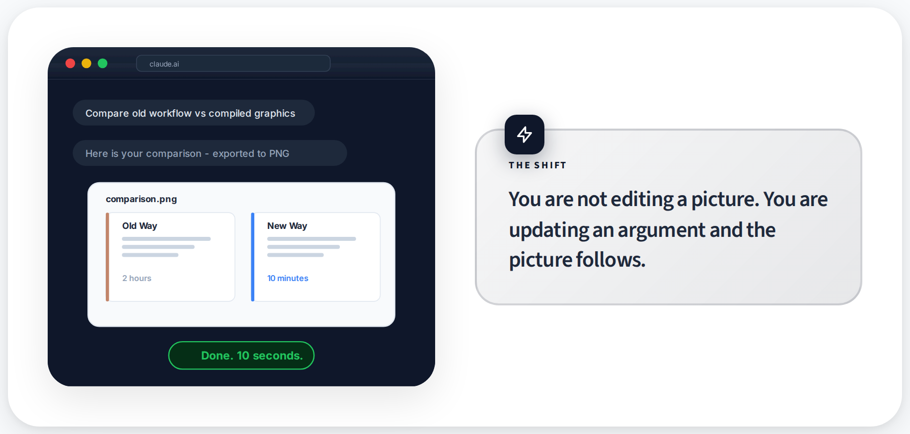
The people who wanted graphics were writers working inside AI assistants — Claude, Cursor, tools where the writing was already happening. They did not want to switch to a terminal to construct a command. They wanted to stay in the conversation and say “make me a comparison for this section.”
This is a lesson that keeps showing up in developer tools: the best feature in the world loses to a mediocre feature that meets people where they already are.
Writers are not in the terminal. They are in the conversation, talking to bots.
Where the writing happens now
The current version runs as an MCP server — a protocol that lets AI assistants call external tools.
In practice, you describe what you need to the assistant: “I need a comparison showing the old workflow versus the new one.” The assistant picks the right layout, fills the fields from your writing, and exports the graphic.
This matters because the workflow becomes:
write the section
identify the beat that needs a visual
tell the assistant
get the graphic
When you revise, you regenerate with updated text and it takes seconds
I published the subscription pricing essay this way last week. Four graphics, zero time in Figma. The comparison of “The Browser” versus “The Buyer” was generated directly from the essay’s own language.
When I tightened the wording in the draft, I regenerated the graphic with the new copy and it matched immediately. The whole graphics pass for a 1,500-word essay took under ten minutes. That used to be a two-hour Figma session.
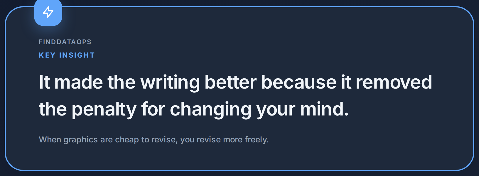
When graphics are cheap to produce, you produce more of them. When they are cheap to revise, you revise the writing more freely because you know the visuals will follow. The tool did not just save time on graphics. It made the writing better because it removed the penalty for changing your mind.
What I learned about consistency
The original version let you customize everything. Colors, fonts, spacing, density. People spent more time configuring the theme than writing the article. That is the Figma problem dressed up in different clothes.
Now templates enforce a visual system. You pick one that matches the tone — editorial, technical, warm, dark — and the template handles every design decision after that. Typography, color roles, whitespace density. You focus on the argument.
This is the same principle that makes Markdown work for writing. You do not choose font sizes in Markdown. You mark a heading as a heading and the renderer handles the rest. Compiled graphics work the same way. You mark a comparison as a comparison and the layout engine handles the visual structure.
The constraint is the feature. When you cannot fiddle with spacing, you stop fiddling with spacing and go back to the writing.
Why this matters beyond one tool
Most publishing workflows treat visuals as the final deliverable. You write, then you design, then you publish. Three phases, three tools, three sets of decisions.
Compiled graphics collapse the last two into the first. The visual is a function of the writing. Change the input, get updated output. The graphic has no independent existence — it is downstream of the argument.
This matters because the best writing gets revised. A lot. And every revision that does not update the graphics creates drift. The graphic says one thing, the text says another, and the reader notices the mismatch even if they cannot articulate why.
Kyle Poyar’s SaaS benchmarks reports includes dozens of charts. Each one maps directly to a data point in the text. If the data changed, the chart would update. Nobody would suggest manually redrawing them in Figma every quarter.
But that is exactly what most writers do with their article graphics. They treat every visual as a one-off craft project instead of a repeatable output. And then they stop revising because the cost of updating the graphics is too high. The design tool becomes a tax on iteration. The more graphics you have, the heavier the tax, and the less you revise.
When your graphics compile from your argument, your revision loop never breaks. The visuals stay current because they have no choice. They are downstream of the words.
The shift to compiled data stories
You are not editing a picture anymore. You are updating an argument and the picture follows.
That is a small sentence with a big implication for anyone who publishes regularly. It means your graphics never lag behind your thinking. It means revision does not create drift. It means you can be as iterative with your visuals as you already are with your prose.
What’s the takeaway? Treat your graphics like compiled code, not crafted art. Define the argument, let the layout engine handle the design, and when you change your mind, regenerate in seconds. The tool makes the writing better because it removes the penalty for changing your mind.
Links for Reading and Sharing
These are links that caught my 👀
1/ Put your agents to work - If you want your LLM Agents to do a good job, you also need to give them reasonable tasks that are well known. Agents are more creative (and effective) when you give them basic building blocks and ask them to combine them in novel ways.
2/ Stripe is building minions - Reading about how Stripe is building agents for their own work will help you see what’s possible. Focus on outcomes and guardrails, not on pure process.
3/ ETL might be dead - Or we might just be realizing that schema-on-demand is now possible, so making connections between different systems is a lot easier than it used to be. But don’t assume that because an LLM says that it can connect A to B that it knows how — this is where the logic of ETL hasn’t died yet.
What to do next
Hit reply if you’ve got links to share, data stories, or want to say hello.