Wireframing is ugly and necessary
What's the first step beyond a Product Requirements Document? A basic sketch to show flows, along with a state diagram of what will happen. Read: "Everything Starts Out Looking Like a Toy" #140

Hi, I’m Greg 👋! I write essays on product development. Some key topics for me are system “handshakes”, the expectations for workflow, and the jobs we expect data to do. This all started when I tried to define What is Data Operations? Next, I decided to start Data & Ops, a fractional product team to create amazing UX and product experiences.
This week’s toy: an April fool’s joke about using dbt with Excel that’s actually clever. If you ever wanted to bring data teams and finance folks together in one plan, you would define semantic models that get expressed with Excel as the business canvas. (I’m betting someone eventually builds this into a real thing.) Edition 140 of this newsletter is here - it’s April 10, 2023.
The Big Idea
A short long-form essay about data things
⚙️ Wireframing is ugly and necessary
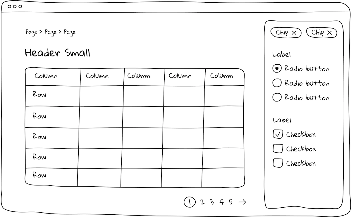
This is not a pretty picture. It’s not something that developers can use to build an app, GPT4 notwithstanding. Prototypes create an initial experience that allows you to imagine what the user experience will be like in an app without making you commit to a final design.
Prototypes short-circuit the part of your brain that makes you want to argue about which hex color of blue you might use or which transition you want to have in a UX flow.
For example, Spencer Bieri at Indeed discusses the challenges of sharing more fully realized designs with users:
Because the designs looked real, research participants often got distracted. They’d share thoughts about things like illustration style, colors, and typography. This feedback isn’t useful at the early stages of designing when visual design isn’t the focus and we’re exploring concepts.
Low-fidelity prototypes give you the minimum you need to start talking about an idea, validate it against the flows you eventually want to build, and do it quickly and cheaply.
Why build prototypes, especially in Figma?
The best way to start a project is to start by starting. Using Figma, it’s easy to find community libraries to get started with a simple prototype and then use the native features of Figma to start building.
If you’ve never used Figma, you should start! It enables you to create simple ideas, annotate them, and invite team members to collaborate. Team members are able to leave comments on an item and draw vector graphics quickly. You can drop in images for inspiration, or use simple pictures like this one.
Notice that in the image above, the navigation of the screen is clear. The basic idea – that you are sharing data in a time-series chart – is also easy to read. Where you don’t get stuck here is the question of what color family to use, what fonts to use, and how pretty to make the buttons.
Breaking down the main benefits of prototyping
Let’s talk about some key benefits of using prototyping to build new features or change existing features.
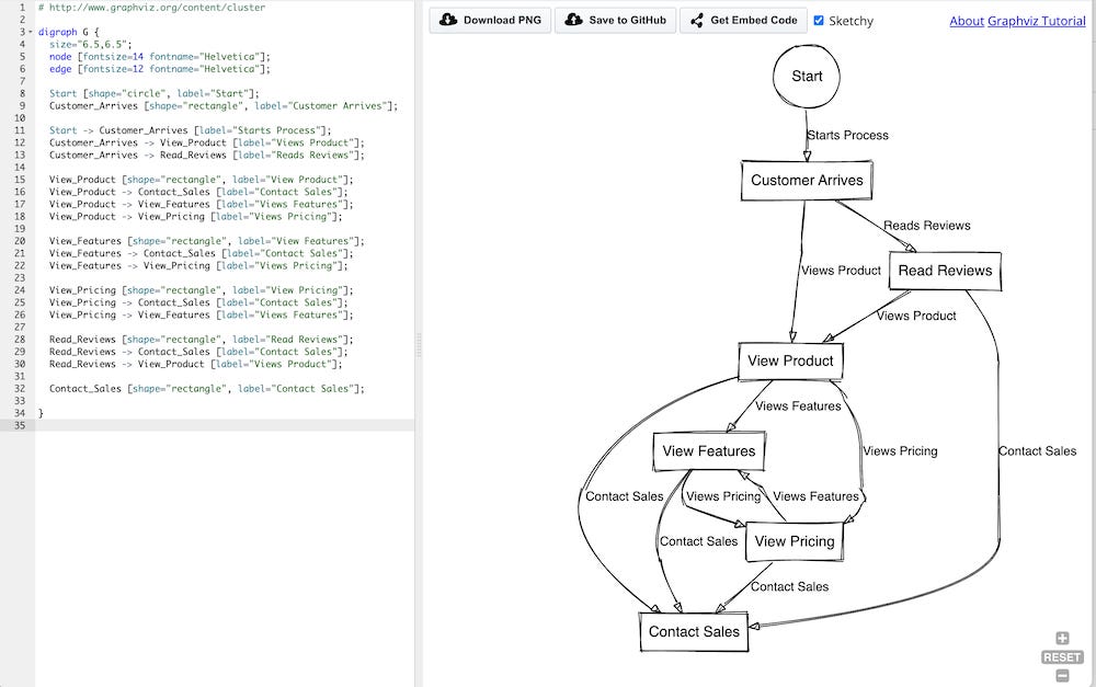
I asked ChatGPT to generate a d2 diagram that imagines a typical b2b scenario where a web visitor comes to a site and has a few options before deciding to contact sales or to take a demo. D2 is a language that defines simple states and helps you make a diagram like this one to show your product flows.
In this case, the customer arrives and has these pathways:
Read Reviews
View Product
View Features
View Pricing
Contact Sales
These are typical entry points for a B2B site - good job, ChatGPT! If you like, you can create prettier versions of these state diagrams using Terrastruct.
Save time and resources
How would you improve this state diagram and build flows to map these ideas?
Prototyping lets you save valuable time and resources when you are thinking about a new feature. Multiple concepts are easy to build, it’s cheap to change, and you can iterate quickly.
One thing you might do here is build a few entry points: a landing page, a mobile site, and a full page experience.
Focus on functionality instead of component skinning
This model lets you focus on the actual UX before you worry about brand details. This means you might create the initial page load along with a UX interaction that happens when the user scrolls or clicks.
Identifying the basics (what the user does) and the next actions (what happens after the user input) gives you a clear view of the information architecture and the “feel” for this flow. Talking through a scenario like this helps you identify “what if” scenarios, like:
Do we want to alert the user if they are viewing the pricing page and they are about to navigate away?
Do we want to have a special experience for the pricing page for a first time viewer or someone who lands on that page?
What does our “request a demo” flow look like?
After asking a few people to review these flows, we get a good sense for whether the feature is working.
Enables quick pivots
When features fall flat, prototyping helps you to make changes almost immediately. During a brainstorm session, quickly make a copy of the existing idea and play with changing its format or moving the elements around.
With this method, product teams can take bigger risks and bigger swings at an idea. This is really useful during the initial stages of a project when you are storming, norming, and forming the ideas that will end up being in the finished idea.
Visually identify design and interaction issues
Another key element of this prototyping process is the use of visual elements.
When I write: “The user enters the website of a b2b company and is presented with a modal and a special offer for an annual plan,” it doesn’t necessarily give you a visual picture.
But this does:
Talking through a simplified view makes the problems obvious. We can talk about whether this should a modal or a persistent bar at the top of the screen. We can discuss whether the rest of the application should be lightboxed or interoperable. And we can suggest other ways for engaging.
Pattern libraries like this one let you start very fast and also let you map use cases and user stories to the flows you’re creating.
What other assets help with prototyping?
There are a few other ideas that will speed your prototyping, including writing out simple user stories and creating a single page product brief to help crystallize your thinking.
User stories
User stories are best written in the jobs to be done style, e.g.
“As a <TYPE OF USER>, I want to <TAKE ACTION> so that I can <REACH RESULT>”
In the simple B2B example above, a few stories might be:
As a website user, I want to browse the web site so that I can understand whether to buy the product
As a product manager, I want to add a specific offer for first time visitors who land on the pricing page so that I can convert them to an annual plan
The goal is not to be exhaustive, but to be evocative of the kinds of goals typical users need to complete. If your prototype doesn’t help them get these goals completed, you’re in trouble.
Product Brief
A product brief is a one page document (it could be more, but people generally don’t read more than a page) detailing the basic tenets of a product.
A brief description of the product and why we’re doing it
Key features, including unique selling points and competitive advantages gained by these features
Target market or persona: who are we building this for?
Key flows that we are building, e.g. “landing on the website for the first time”
Calls to action and any metrics we are using to track these results, e.g. the conversion funnel for users to paid
Having user stories, a product brief, and some prototypes to test will help your end product be closer to the mark and easier to improve.
What’s the takeaway? Prototyping looks ugly. It kind of has to, because you’re seeing the parts of the process where ideas have rough edges and aren’t fully formed. Done right, a prototyping process quickly moves through this stage and lands on a definition that product and engineering (and GTM teams) can celebrate. Figma is a particularly good tool for this process because it facilitates quick, collaborative change.
Links for Reading and Sharing
These are links that caught my 👀
1/ Master class in pricing - Peter Ramsey breaks down the way that Netflix entices you to try their ad-free plan to get you into their engaged funnel which eventually results in a higher plan paid conversion. Counter-intuitively, they hide access to the cheaper plan.
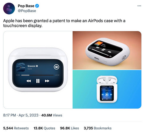
2/ We’ve seen this movie before - if this picture looks like an iPod to you, it’s intentional. Apple is exploring how to expand existing technology into new and adjacent product surfaces. I love how they imagine simple complementary ideas and places to evolve their interfaces. If you’ve used any Apple product, you’ll know how to use this.

I3/ Pour one out for Dark Sky - This is a love letter to weather visualization comparing Dark Sky, a leading weather app that Apple bought, with the revised Weather app that Apple created. While adding Dark Sky’s functionality improved the Weather app, the old app’s simplicity and ease of use also went away.
What to do next
Hit reply if you’ve got links to share, data stories, or want to say hello.
Want more essays? Read on Data Operations or other writings at gregmeyer.com.
Want to book a discovery call to talk about how we can work together?
The next big thing always starts out being dismissed as a “toy.” - Chris Dixon


