

If code could talk, it would write these diagrams
Make documentation a first class citizen by using a domain-specific language to write beautiful visual charts. "Everything Starts Out Looking Like a Toy", #121


Hi, I’m Greg 👋! I write essays on product development. Some key topics for me are system “handshakes”, the expectations for workflow, and the jobs we expect data to do. This all started when I tried to define What is Data Operations?
This week’s toy: a series of wooden dolls that sing as a choir. Edition 121 of this newsletter is here - it’s November 28, 2022.
The Big Idea
A short long-form essay about data things
⚙️ If code could talk, it would write these diagrams

One of the biggest unsolved problems in software is making the code (and the output of that code) easier to read and understand. The reasons for this are pretty clear. The gap between what’s written by engineers and what’s understood by the rest of the team is also well-known. Engineers write code to complete tasks, and that code must mostly be understood by engineers. Engineers and business users need to talk to and understand each other, but it’s hard to translate code into state diagrams or process narratives.
Business users like to look at pictures and read diagrams to learn about processes. They write documents and slides about the business process to explain how systems work (and should work). There is a similar gap in translating business process to code as there is in translating code to process. Engineers need clear requirements, state diagrams, and edge case explanations to understand how to build code that will work to fulfill the business expectations.
What would you normally do to document code?
One traditional method to document code asks developers to first write a shorthand to each other (using /* comments */ inside of the actual code blocks. A developer or a Product Manager then needs to summarize the output of this code based on observing how it behaves during use or describing the operation of this code at a high level (functionally, perhaps with pictures or bullet-point descriptions).
Great documentation balances the need to know exactly what is happening in the code with the need to understand how that code changes or affects the rest of the product. When you are discussing a machine interface like an Application Programming Interface (API), this documentation must be exact, because the machine needs to parse the input to know what to do. When you are describing generally what’s going on in the software, it’s often more important to define the concepts and to build a narrative that enables a non-technical user to understand this system and interact with it using the actual interactions of the software.
Building a visual narrative for code
There are some great drawing tools out there to document the process. Whether you use something like Lucid Charts, Draw.io, or build your diagrams by hand in Figma, your documentation journey will be similar:
Describe in words what’s happening on the screen
Decide whether you want to show a high level of detail or a summary
Draw pictures using words and shapes that match your description and drawing
When you create this picture, you’re betting that the rest of the code won’t change. Updating your drawing requires you to go back into your drawing app and make changes to match the new state of the code. Not bad to do once, but when you have to do this over and over again, it gets old.
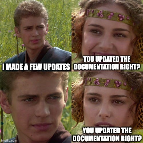
The traditional method to build a process diagram works well if the documentation process follows the completed code. Most software doesn’t follow this static process and there are changes that frequently need to be made. We’ve created an almost perpetual change/break process of documentation gaps.
What if documentation happened alongside code?
In a perfect world, documentation would happen in commented code blocks and the compiled documentation could be built on every code push. This might be an unattainable dream, as software engineers probably need to spend more time writing code than documenting exactly how it works.
However, we *could* expect software engineers to call out in their code when an important piece of functionality needs to be documented and to point to a resource that would optionally render that documentation. In this world, hybrid technical documentation could exist alongside the code that gets created, building process diagrams, regular English descriptions, and generally making software friendlier for the business user.
A key way to bridge this gap is a DSL (domain-specific language) for building documentation with declarative diagramming. DSLs to create diagrams are a great way to separate the logic of programming from the description of the output of the programming. This approach also borrows from the systems that make programming easier by adopting these attributes:
a text-based file that can be stored in a version control system
a generator that creates images from this text
a build process that can be automated when changes occur
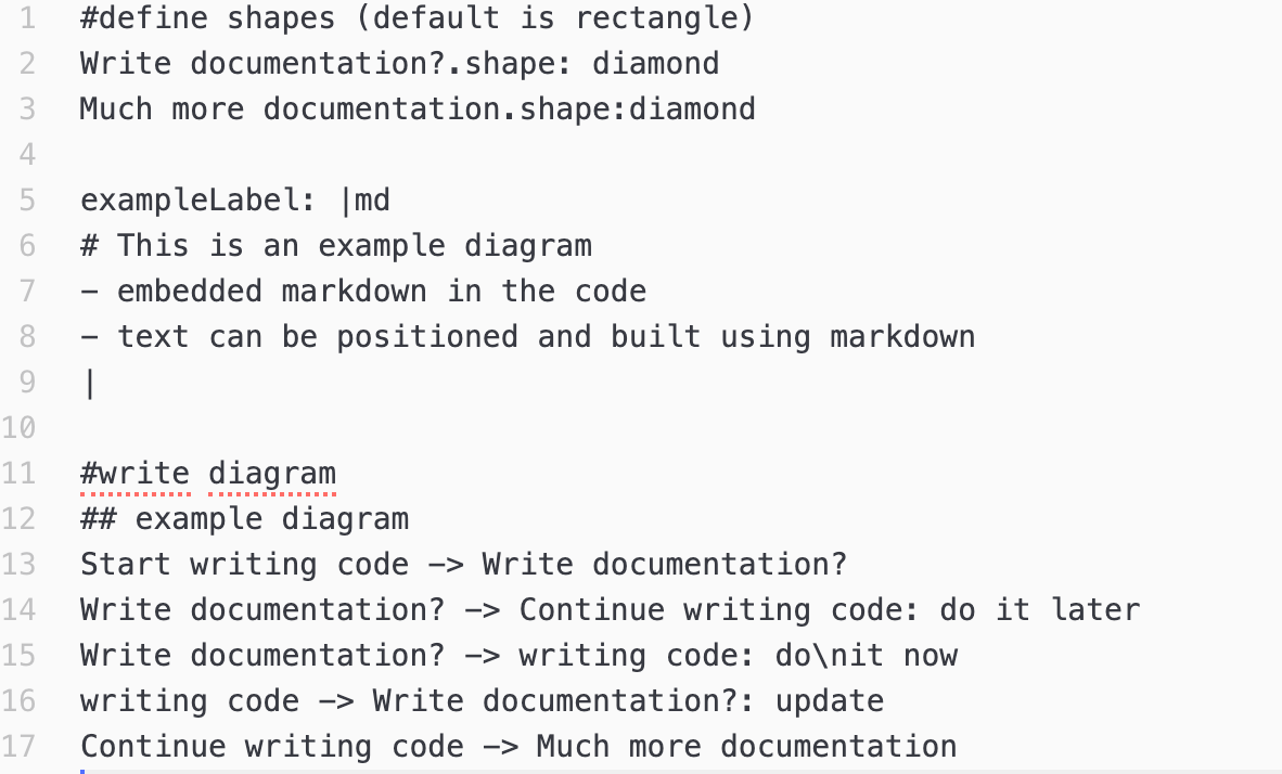
Here is an example of a simple diagram generated in D2, a language to describe diagrams.

Here’s the pseudo-code that wrote this diagram:
It would be easy for a programmer to link to this file as the definition/documentation for a single process or perhaps a group of processes, and for a technical writer to work on this documentation simultaneously during code development.
Are we ready to use DSLs to generate diagrams?
Building a domain-specific language for graphing is not new. If you’ve investigated this problem before, you may have run into these examples:
If you want to see the relative differences between these and D2, this is a helpful comparison site. D2 feels like a shiny new entrant in this space, and not without its own problems if you are looking to auto-generate diagrams and build them into your code.
Like all semantic layers, these tools need to be translated from raw code into a representation of that code. In lay terms, they need to be summarized according to a translation of sorts (a dialect of the Domain-Specific Language).
All of these languages feel like half-done solutions. They are great if you wanted to auto-generate diagrams and build this into your code. But if you want to create consistent representations of process across your app, using the same DSL solves only part of the problem.
Enter Terrastruct, which is software created to solve the problem of managing technical documentation while remaining highly customizable. With this tool, you can see changes instantly and store them in a version control system. This lets you create a densely layered process that anyone can read and appreciate, giving the technical documentation team a powerful tool while not holding the engineering team back with new requirements.
What now?
It’s tempting to think that having a strategy for documentation will create great documentation automatically. There are many reasons that documentation is often out of date. A few look like this:
Concepts may not map immediately to things that are happening in the code
Different users need different levels of documentation
Docs may need to look different in context, e.g. where they are used
Using a Domain Specific Language for documentation gives you the tools (and the language) to react quickly and to put placeholders where the documentation team can fill them out to deliver better documentation for users.
What’s the takeaway? Documenting code requires good process. Use this both to identify the places you want to document and to author with a flexible tool like a domain-specific language for diagramming to create diagrams anyone can read. But don’t forget that you need to do more than auto-document to create value. Truly useful documentation builds on an internal grammar and reads like language to coders and users alike.
Links for Reading and Sharing
These are links that caught my 👀
1/ Graphs don’t tell the whole story - Complicated information flows, like the Sankey Diagram, don’t always give you an easy road to interpretation until you segment the data. Looking at all of the flows sandwiched together gives you too much information. The solution? Filter the data using a segment you want to examine, then compare the outcomes among segments related to the overall picture.

2/ Designing with Data - Should you use a pie chart, a line graph, or a table to describe information? This interactive delivers a solid example of when to use different types of data visualization to solve design issues.
3/ Storytelling applied to product - You might be spending the long weekend watching the latest Hollywood blockbuster by Pixar (or Disney). But how do they build a story structure that’s so compelling? Shahed Khalili shares how you can take this framework and apply it to the hero of your user story.
What to do next
Hit reply if you’ve got links to share, data stories, or want to say hello.
Want more essays? Read on Data Operations or other writings at gregmeyer.com.
The next big thing always starts out being dismissed as a “toy.” - Chris Dixon